Customization
Before diving into all the things you can customize, let's first understand the calendar's components and how they relate to each other.
Anatomy
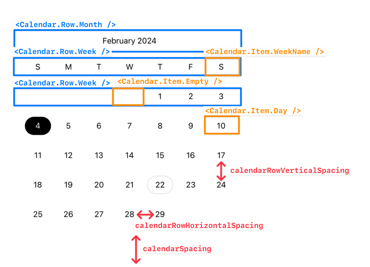
| Component | Description | Layout-related props |
|---|---|---|
Calendar | The main calendar component. | calendarSpacing |
Calendar.Row.Month | Renders the month row of the calendar | calendarMonthHeaderHeight, getCalendarMonthFormat |
Calendar.Row.Week | Renders each week row of the calendar, including the week day names. | calendarWeekHeaderHeight, calendarRowHorizontalSpacing, calendarRowVerticalSpacing |
Calendar.Item.Day | Renders the day item of the calendar (e.g. 1, 2, 3, etc.) | calendarDayHeight, getCalendarDayFormat |
Calendar.Item.WeekName | Renders the week day name item of the calendar (e.g. Sun, Mon, Tue, etc.) | getCalendarWeekDayFormat, calendarFirstDayOfWeek |
Calendar.Item.Empty | Renders an empty item to fill the calendar's grid in the start or end of the month. |
Customization strategies
There are two main strategies to customize the calendar:
- Using the
themeprop: the easiest way. - Composing your own calendar: the most flexible way.
Theme prop
The theme prop enables you to change every single style of the base calendar. For most cases, this should be enough to achieve the desired look and feel. Here's an example mimicking Linear's calendar:
import { CalendarTheme } from "@marceloterreiro/flash-calendar";

const linearAccent = "#585ABF";

const linearTheme: CalendarTheme = {
  rowMonth: {
    content: {
      textAlign: "left",
      color: "rgba(255, 255, 255, 0.5)",
      fontWeight: "700",
    },
  },
  rowWeek: {
    container: {
      borderBottomWidth: 1,
      borderBottomColor: "rgba(255, 255, 255, 0.1)",
      borderStyle: "solid",
    },
  },
  itemWeekName: { content: { color: "rgba(255, 255, 255, 0.5)" } },
  itemDayContainer: {
    activeDayFiller: {
      backgroundColor: linearAccent,
    },
  },
  itemDay: {
    idle: ({ isPressed, isWeekend }) => ({
      container: {
        backgroundColor: isPressed ? linearAccent : "transparent",
        borderRadius: 4,
      },
      content: {
        color: isWeekend && !isPressed ? "rgba(255, 255, 255, 0.5)" : "#ffffff",
      },
    }),
    today: ({ isPressed }) => ({
      container: {
        borderColor: "rgba(255, 255, 255, 0.5)",
        borderRadius: isPressed ? 4 : 30,
        backgroundColor: isPressed ? linearAccent : "transparent",
      },
      content: {
        color: isPressed ? "#ffffff" : "rgba(255, 255, 255, 0.5)",
      },
    }),
    active: ({ isEndOfRange, isStartOfRange }) => ({
      container: {
        backgroundColor: linearAccent,
        borderTopLeftRadius: isStartOfRange ? 4 : 0,
        borderBottomLeftRadius: isStartOfRange ? 4 : 0,
        borderTopRightRadius: isEndOfRange ? 4 : 0,
        borderBottomRightRadius: isEndOfRange ? 4 : 0,
      },
      content: {
        color: "#ffffff",
      },
    }),
  },
};

export const LinearCalendar = memo(() => {
  return (
    <Calendar
      calendarDayHeight={30}
      calendarFirstDayOfWeek="sunday"
      calendarMonthId={toDateId(new Date())}
      calendarRowHorizontalSpacing={16}
      calendarRowVerticalSpacing={16}
      onCalendarDayPress={(dateId) => console.log(`Pressed date ${dateId}`)}
      theme={linearTheme}
    />
  );
});
Check out the full source code here.
Composing your own calendar
Sometimes, you need more than just changing styles. You might want to change the layout, add new components, or even remove some of them. In this case, you can easily build your own calendar using the base Calendar components from above.
The sky is the limit here. Here are two demos from the example app:
Changing the text props
You can override the textProps to control the nested Text components. For example disabling font scaling for accessibility on the Calendar's Day:
import {
  Calendar,
  useOptimizedDayMetadata,
} from "@marceloterreiro/flash-calendar";
import { Text } from "react-native";
import type { CalendarItemDayWithContainerProps } from "@/components/CalendarItemDay";

import { useRenderCount } from "./useRenderCount";

export const PerfTestCalendarItemDayWithContainer = ({
  children,
  metadata: baseMetadata,
  onPress,
  theme,
  dayHeight,
  daySpacing,
  containerTheme,
}: CalendarItemDayWithContainerProps) => {
  const metadata = useOptimizedDayMetadata(baseMetadata);
  const renderCounter = useRenderCount();

  return (
    <Calendar.Item.Day.Container
      dayHeight={dayHeight}
      daySpacing={daySpacing}
      isStartOfWeek={metadata.isStartOfWeek}
      shouldShowActiveDayFiller={
        metadata.isRangeValid && !metadata.isEndOfWeek
          ? !metadata.isEndOfRange
          : false
      }
      theme={containerTheme}
    >
      <Calendar.Item.Day
        textProps={{ allowFontScaling: false }}
        height={dayHeight}
        metadata={metadata}
        onPress={onPress}
        theme={theme}
      >
        {children}
        <Text
          style={{
            fontSize: 8,
            fontStyle: "italic",
            textAlign: "center",
            color: metadata.state === "active" ? "white" : "black",
          }}
        >
          {"\n"}render: {renderCounter}x
        </Text>
      </Calendar.Item.Day>
    </Calendar.Item.Day.Container>
  );
};
Overriding the hovered and focused interaction states
If you need to support web Pressable InteractionStates, you can also leverage isHovered and isFocused alongside isPressed:
import { CalendarTheme } from "@marceloterreiro/flash-calendar";

const linearAccent = "#585ABF";

const linearTheme: CalendarTheme = {
  rowMonth: {
    content: {
      textAlign: "left",
      color: "rgba(255, 255, 255, 0.5)",
      fontWeight: "700",
    },
  },
  rowWeek: {
    container: {
      borderBottomWidth: 1,
      borderBottomColor: "rgba(255, 255, 255, 0.1)",
      borderStyle: "solid",
    },
  },
  itemWeekName: { content: { color: "rgba(255, 255, 255, 0.5)" } },
  itemDayContainer: {
    activeDayFiller: {
      backgroundColor: linearAccent,
    },
  },
  itemDay: {
    idle: ({ isPressed, isHovered, isWeekend }) => ({
      container: {
        backgroundColor: isPressed || isHovered ? linearAccent : "transparent",
        borderRadius: 4,
      },
      content: {
        color: isWeekend && !isPressed ? "rgba(255, 255, 255, 0.5)" : "#ffffff",
      },
    }),
    today: ({ isPressed, isHovered }) => ({
      container: {
        borderColor: "rgba(255, 255, 255, 0.5)",
        borderRadius: isPressed || isHovered ? 4 : 30,
        backgroundColor: isPressed || isHovered ? linearAccent : "transparent",
      },
      content: {
        color: isPressed || isHovered ? "#ffffff" : "rgba(255, 255, 255, 0.5)",
      },
    }),
    active: ({ isEndOfRange, isStartOfRange }) => ({
      container: {
        backgroundColor: linearAccent,
        borderTopLeftRadius: isStartOfRange ? 4 : 0,
        borderBottomLeftRadius: isStartOfRange ? 4 : 0,
        borderTopRightRadius: isEndOfRange ? 4 : 0,
        borderBottomRightRadius: isEndOfRange ? 4 : 0,
      },
      content: {
        color: "#ffffff",
      },
    }),
  },
};

export const LinearCalendar = memo(() => {
  return (
    <Calendar
      calendarDayHeight={30}
      calendarFirstDayOfWeek="sunday"
      calendarMonthId={toDateId(new Date())}
      calendarRowHorizontalSpacing={16}
      calendarRowVerticalSpacing={16}
      onCalendarDayPress={(dateId) => console.log(`Pressed date ${dateId}`)}
      theme={linearTheme}
    />
  );
});