Usage
All Flash Calendar props contain the word calendar to improve IDE autocompletion (e.g. calendarMinDateId, calendarActiveDateRanges, getCalendarDayFormat).
Basic usage
Here's the minimal example to render a Calendar and a Calendar.List:
Calendar
import { Calendar, toDateId } from "@marceloterreiro/flash-calendar";
import { useState } from "react";
import { Text, View } from "react-native";
const today = toDateId(new Date());
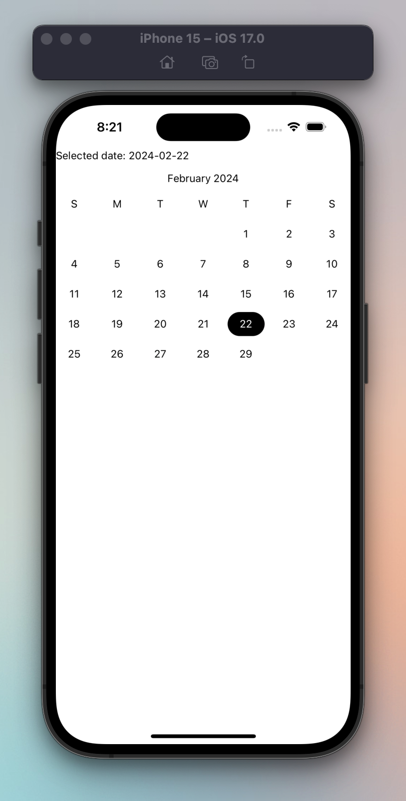
export function BasicCalendar() {
const [selectedDate, setSelectedDate] = useState(today);
return (
<View>
<Text>Selected date: {selectedDate}</Text>
<Calendar
calendarActiveDateRanges={[
{
startId: selectedDate,
endId: selectedDate,
},
]}
calendarMonthId={today}
onCalendarDayPress={setSelectedDate}
/>
</View>
);
}
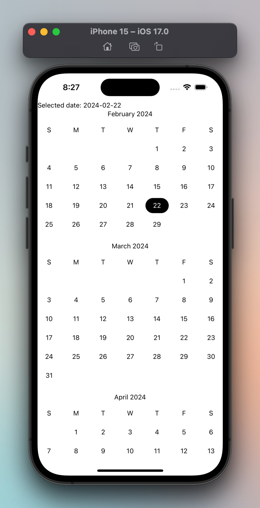
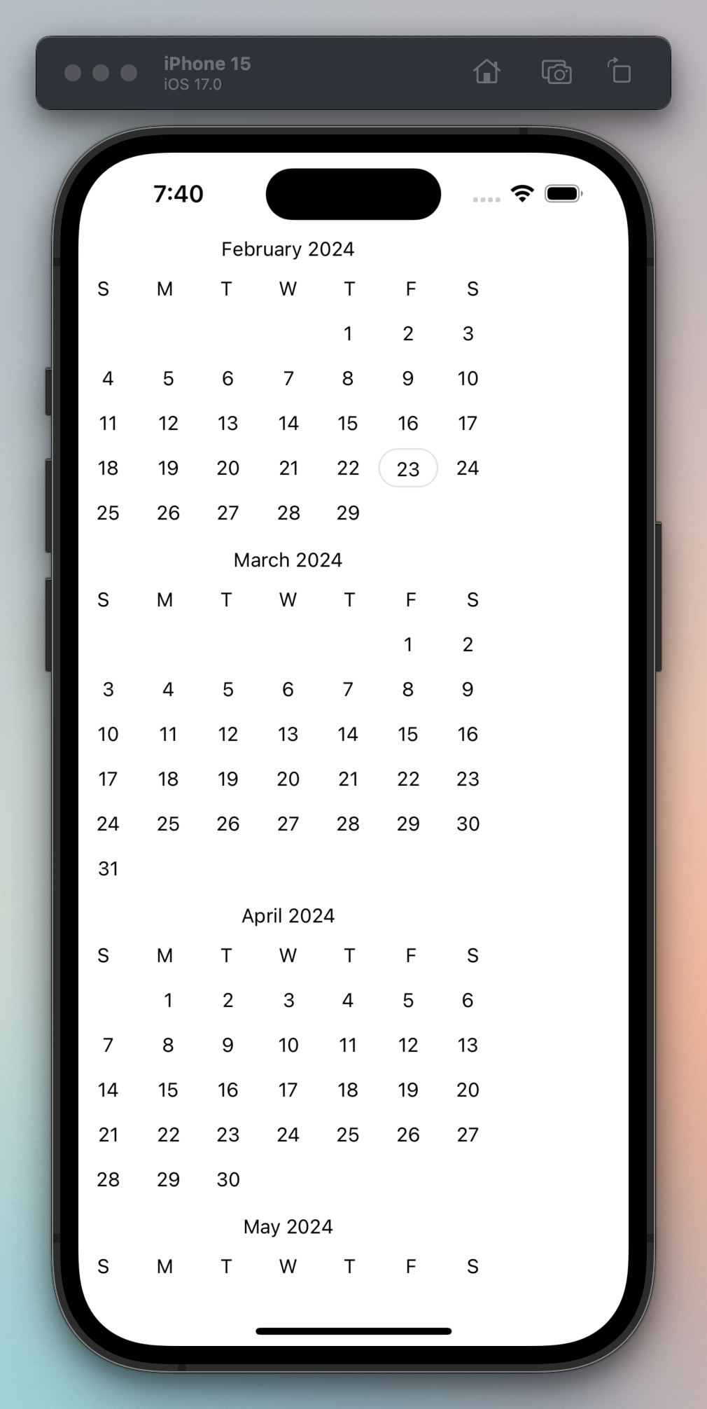
Calendar.List
import { Calendar, toDateId } from "@marceloterreiro/flash-calendar";
import { useState } from "react";
import { Text, View } from "react-native";

const today = toDateId(new Date());

export function BasicCalendarList() {
  const [selectedDate, setSelectedDate] = useState(today);

  return (
    <View style={{ flex: 1 }}>
      <Text>Selected date: {selectedDate}</Text>
      <Calendar.List
        calendarActiveDateRanges={[
          {
            startId: selectedDate,
            endId: selectedDate,
          },
        ]}
        calendarInitialMonthId={today}
        onCalendarDayPress={setSelectedDate}
      />
    </View>
  );
}
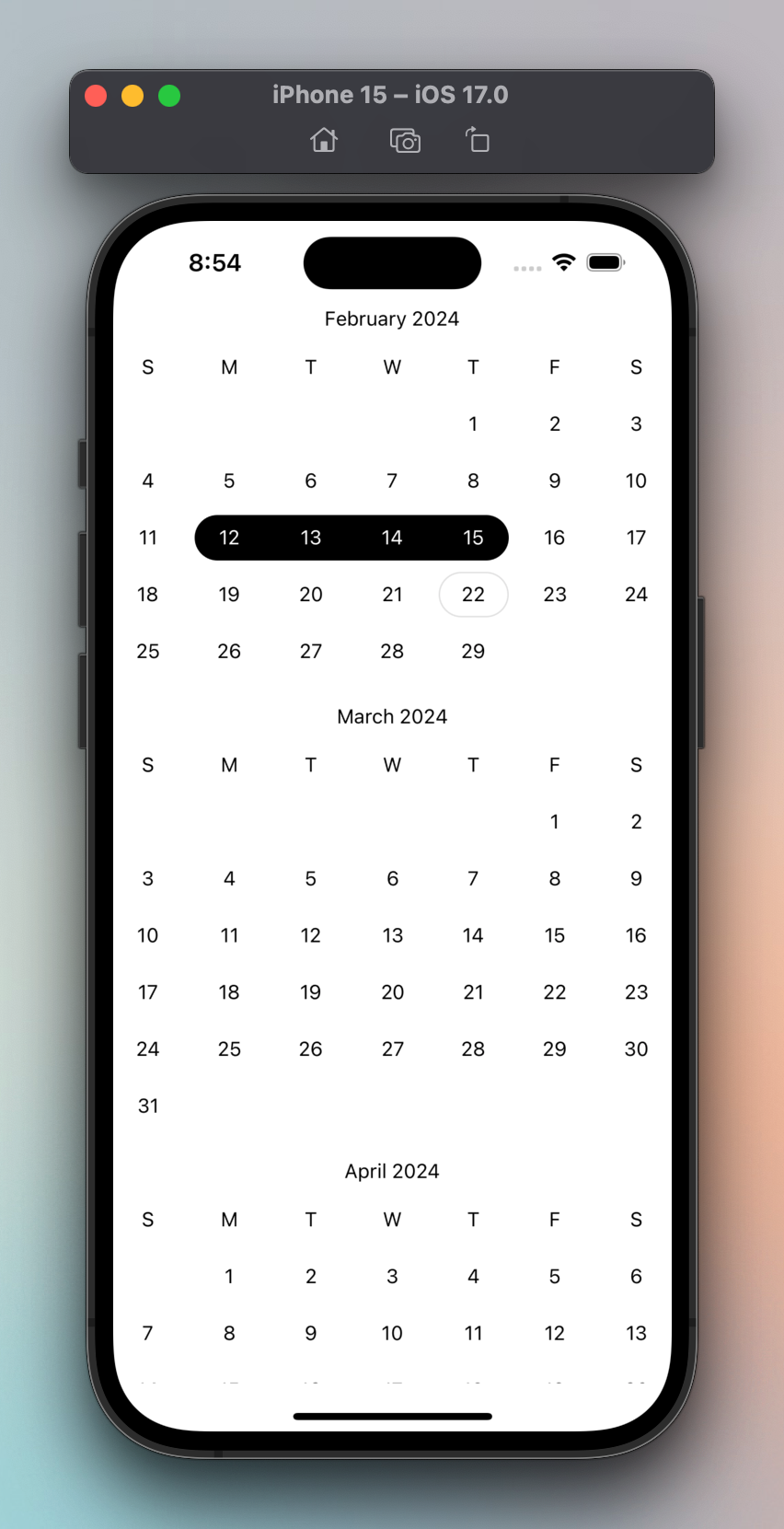
Date range picker
Building a date range picker with Flash Calendar is easy thanks to the
useDateRange
hook:
import { Calendar, useDateRange } from "@marceloterreiro/flash-calendar";

export const CalendarListDateRange = () => {
  const {
    calendarActiveDateRanges,
    onCalendarDayPress,
    // Also available for your convenience:
    // dateRange, // { startId?: string, endId?: string }
    // isDateRangeValid, // boolean
    // onClearDateRange, // () => void
  } = useDateRange();
  return (
    <Calendar.List
      calendarActiveDateRanges={calendarActiveDateRanges}
      onCalendarDayPress={onCalendarDayPress}
    />
  );
};
Localization and date formatting
Flash Calendar was built with a "bring your own date library" approach. This means you can use your preferred date library to format how the dates, weeks and months are displayed.
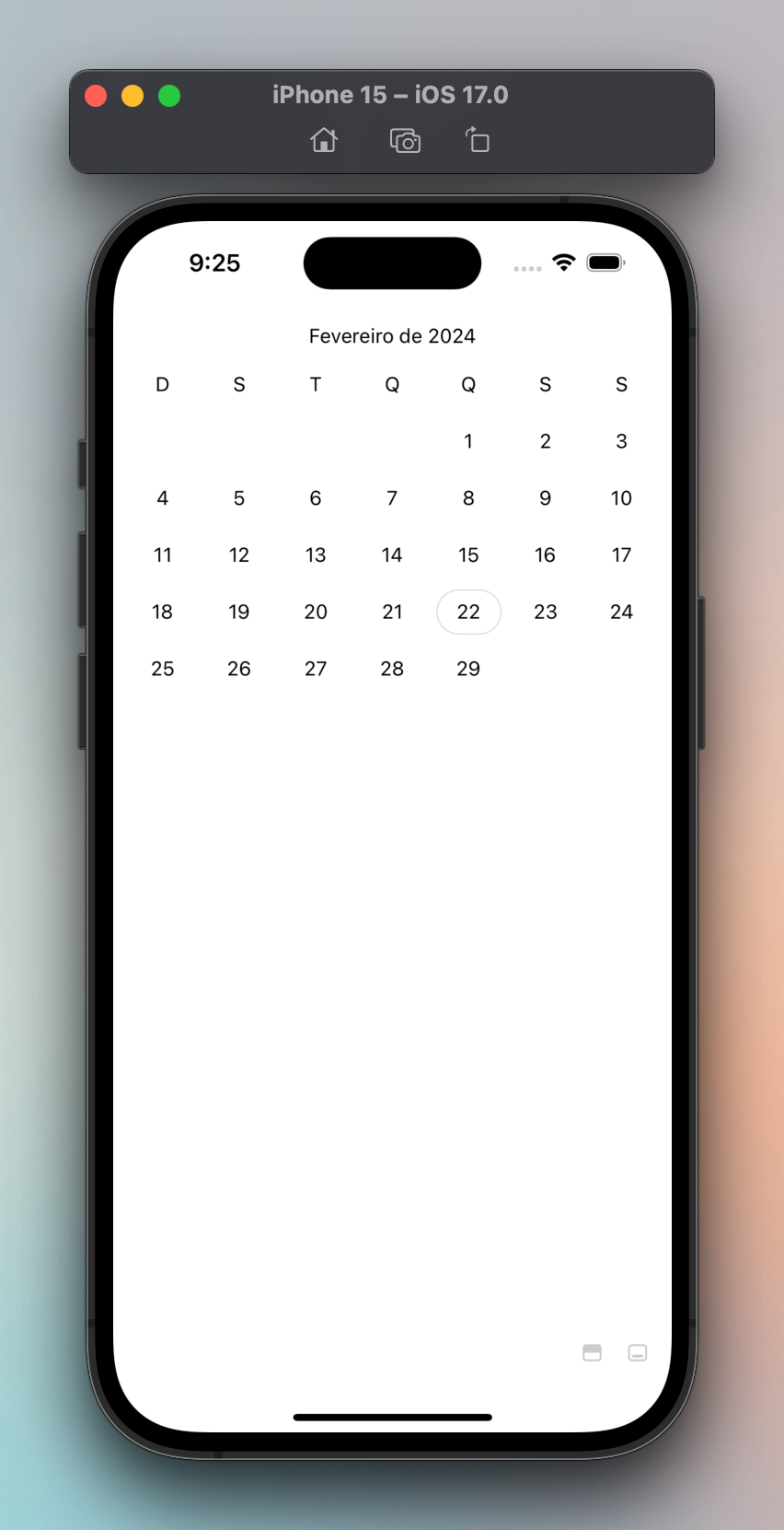
Different locale
If you just need a different locale, use the calendarFormatLocale prop:
import { Calendar, toDateId } from "@marceloterreiro/flash-calendar";
import { useState } from "react";

const today = toDateId(new Date());

export function BrazilianCalendar() {
  const [selectedDate, setSelectedDate] = useState(today);
  return (
    <Calendar
      calendarActiveDateRanges={[
        {
          startId: selectedDate ?? undefined,
          endId: selectedDate ?? undefined,
        },
      ]}
      calendarMonthId={today}
      calendarFormatLocale="pt-BR"
      onCalendarDayPress={setSelectedDate}
    />
  );
}
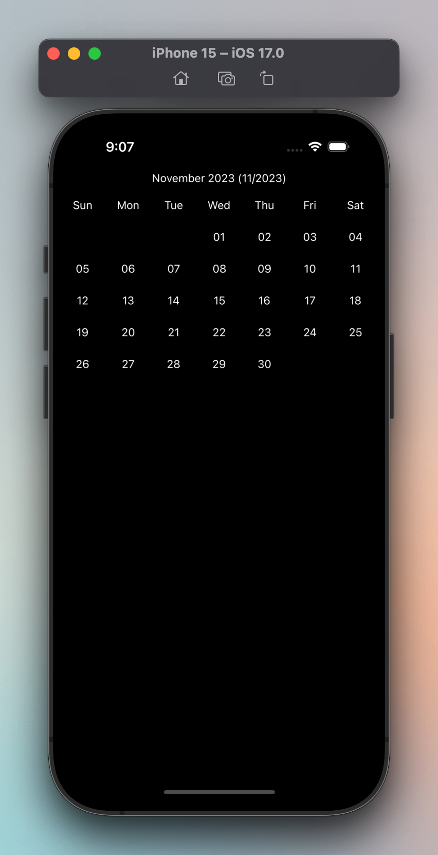
Custom date formatting
If you need full control over how the dates are displayed, use the
getCalendarDayFormat, getCalendarMonthFormat and getCalendarWeekDayFormat
props. They share the same
signature
and allow you to use your preferred date library:
import { Calendar, toDateId } from "@marceloterreiro/flash-calendar";
import { subMonths } from "date-fns";
import { format } from "date-fns/fp";

const threeMonthsAgo = subMonths(new Date(), 3);

export const CalendarCustomFormatting = () => {
  return (
    <Calendar
      calendarMonthId={toDateId(threeMonthsAgo)}
      getCalendarDayFormat={format("dd")}
      getCalendarMonthFormat={format("MMMM yyyy (LL/yyyy)")}
      getCalendarWeekDayFormat={format("E")}
      onCalendarDayPress={(dateId) => {
        console.log(`Clicked on ${dateId}`);
      }}
    />
  );
};
Note on referential equality
Due to Flash Calendar's architecture, it's important to make your date
formatting functions stable. You should move them outside the component
scope (preferred) or memoize them with useCallback. Refer to Issue
69 for more.
Make the formatting functions stable.
const today = toDateId(new Date());

const Example = () => {
  return (
    <View style={{ flex: 1 }}>
      <Calendar
        calendarMonthId={today}
        getCalendarWeekDayFormat={formatWeekDay}
      />
    </View>
  );
};

const formatWeekDay = (date: Date) =>
  format(date, "EEEEEE");
Break referential equality by inlining the formatting functions.
<Calendar
  calendarMonthId={today}
  getCalendarWeekDayFormat={(date) =>
    // prettier-ignore
    format(date, "EEEEEE")
  }
/>
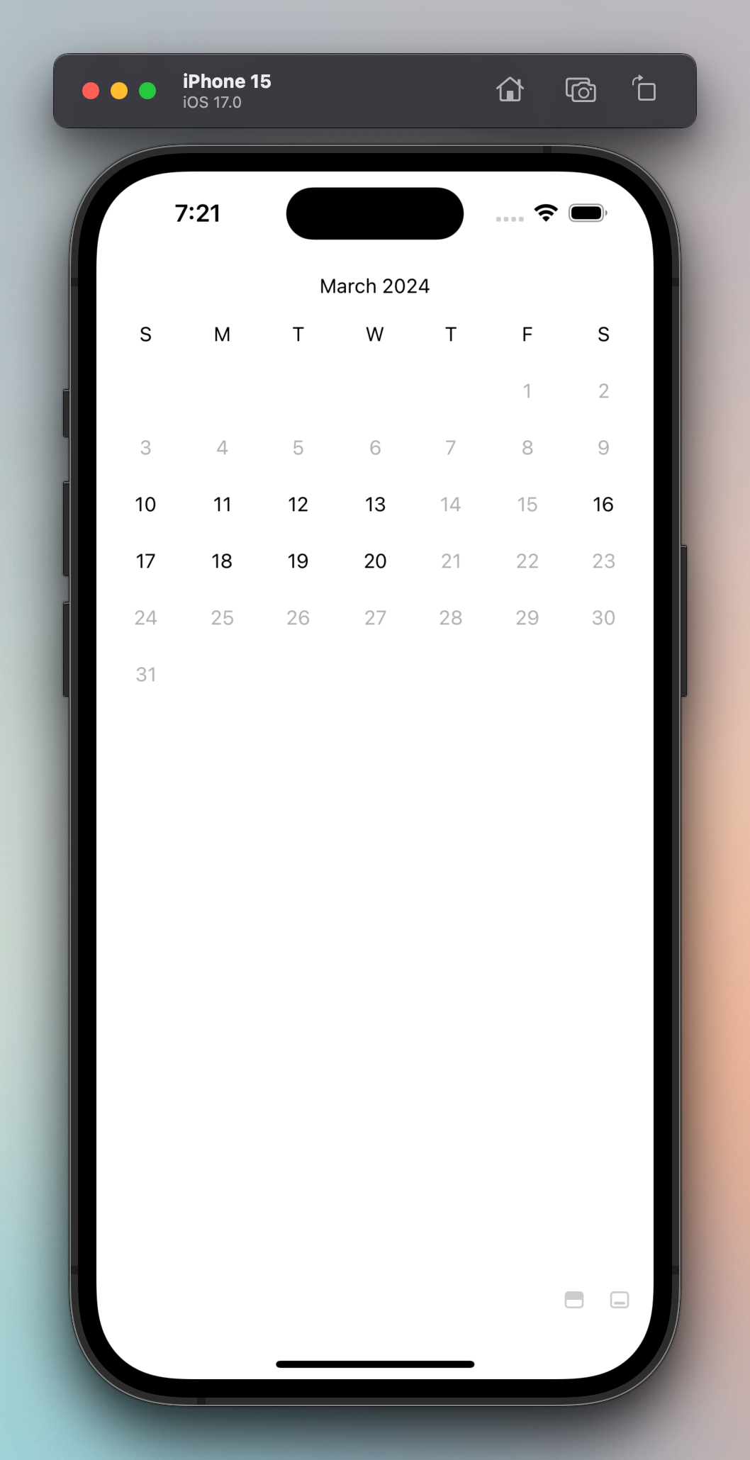
Min, max and disabled dates
You can limit the range of selectable dates by using the calendarMinDateId and
calendarMaxDateId props. The calendarDisabledDateIds prop can be
used to disable specific dates.
This works for both Calendar and Calendar.List:
import { Calendar, toDateId } from "@marceloterreiro/flash-calendar";

const calendarDisabledDateIds = ["2024-03-14", "2024-03-15"];

export const CalendarCustomFormatting = () => {
  return (
    <Calendar
      calendarDisabledDateIds={calendarDisabledDateIds}
      calendarMaxDateId="2024-03-20"
      calendarMinDateId="2024-03-10"
      calendarMonthId="2024-03-01"
      onCalendarDayPress={(dateId) => {
        console.log(`Clicked on ${dateId}`);
      }}
    />
  );
};
Custom size and spacing
There are several props to tweak the spacings between the components. Check the Anatomy section in the Customization docs for more:
import { Calendar } from "@marceloterreiro/flash-calendar";
import { View } from "react-native";

export const CalendarListCompact = () => {
  return (
    <View style={{ width: 300, flex: 1 }}>
      <Calendar.List
        calendarDayHeight={28}
        calendarMonthHeaderHeight={20}
        calendarRowHorizontalSpacing={0}
        calendarRowVerticalSpacing={4}
        calendarSpacing={10}
        onCalendarDayPress={(dateId) => console.log(`Pressed ${dateId}`)}
      />
    </View>
  );
};
Bottom sheet
You can replace the base FlashList component by passing the
CalendarScrollComponent prop to Calendar.List. This is useful when you want
to use Flash Calendar in an Android bottom sheet.
import BottomSheet from "@gorhom/bottom-sheet";
import { Calendar } from "@marceloterreiro/flash-calendar";
import { FlashList } from "@shopify/flash-list";
import React, { useCallback, useMemo, useRef } from "react";
import { Platform, StyleSheet, View } from "react-native";

import { BottomSheetFlashList } from "./components/BottomSheetFlashList";

/**
 * iOS works fine with default flash list. Is better to keep it
 * since it's more performant.
 */
const SafeFlashList = Platform.select({
  android: BottomSheetFlashList,
  ios: FlashList,
});

export const BottomSheetCalendar = () => {
  const bottomSheetRef = useRef<BottomSheet>(null);
  const snapPoints = useMemo(() => ["25%", "50%"], []);

  return (
    <View style={styles.container}>
      <BottomSheet index={1} ref={bottomSheetRef} snapPoints={snapPoints}>
        <View style={styles.contentContainer}>
          <Calendar.List
            CalendarScrollComponent={SafeFlashList}
            calendarInitialMonthId="2024-02-01"
            onCalendarDayPress={(dateId) => console.log(`Pressed ${dateId}`)}
          />
        </View>
      </BottomSheet>
    </View>
  );
};
For a reference implementation of the BottomSheetFlashList component, check
the
source.
Bear in mind this isn't a very performant implementation. Contributions
welcomed!
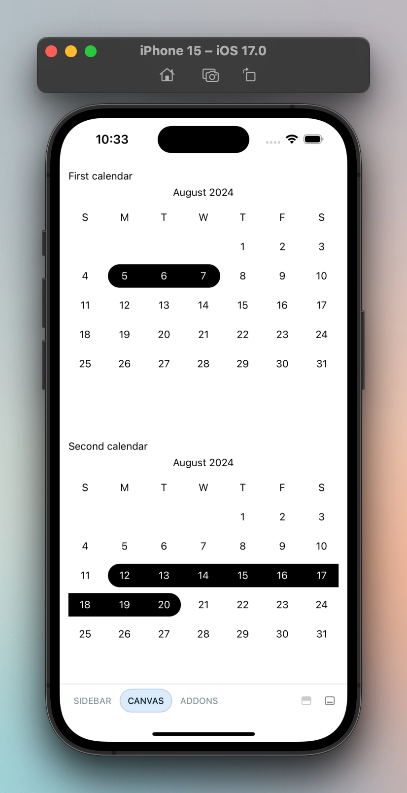
Two calendars in the same screen
To render more than one calendar in the same screen, use the
calendarInstanceId prop. This works for both Calendar and Calendar.List:
import { Calendar, useDateRange } from "@marceloterreiro/flash-calendar";

export const TwoCalendarsMounted = () => {
  const dateRangeOne = useDateRange();
  const dateRangeTwo = useDateRange();
  return (
    <VStack grow spacing={48}>
      <VStack grow spacing={4}>
        <Text>First calendar</Text>
        <Calendar
          calendarInstanceId="First"
          calendarMonthId="2024-08-01"
          {...dateRangeOne}
        />
      </VStack>
      <VStack grow spacing={4}>
        <Text>Second calendar</Text>
        <Calendar
          calendarInstanceId="Second"
          calendarMonthId="2024-08-01"
          {...dateRangeTwo}
        />
      </VStack>
    </VStack>
  );
};